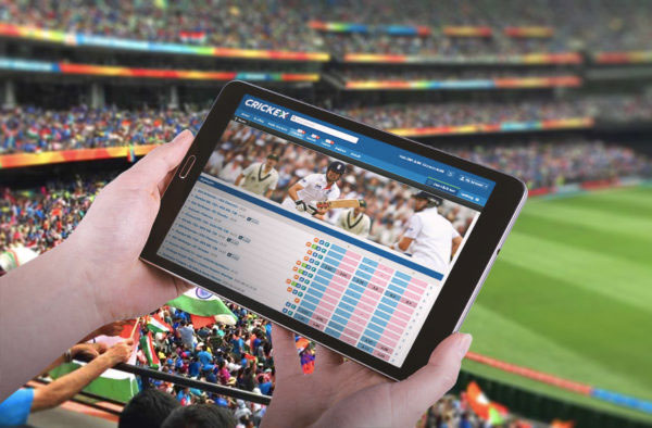
A live cricket app has to work inside a very specific behavior pattern: the match is playing, the scorecard is open, group chats are loud, and the odds view gets checked in short bursts. In India, that pattern is amplified by mobile-first usage and connectivity that can shift from solid to shaky in minutes. A good live experience does not try to dominate attention. It stays predictable, keeps markets readable, and makes it easy to re-enter without hunting for the same rows again.
The most dependable apps treat live markets as a reliability problem. The numbers can change fast. The interface should not. When the layout stays stable, users feel in control during tight chases. That is the point of good design in a high-velocity environment.
Re-entry design that survives switching between apps
Most users do not sit on one screen for an entire innings. They bounce. That makes “re-entry” the primary UX moment. The app should preserve scroll position, remember which market groups were expanded, and keep the market hierarchy consistent across the match. If a user left during 15.2 overs and returns at 16.1, the odds view should still feel familiar. Auto-collapsing sections, re-sorting markets, or jumping the scroll position forces users to rebuild context, which increases errors.
In that re-entry flow, live cricket betting app in india becomes more usable when the app treats market structure as fixed scaffolding. Values can update in place, but the user’s mental map stays intact. That design choice reduces cognitive load during the most stressful phases of a chase, when price movement is the fastest.
Connectivity-aware behavior that stays honest
Variable networks are a baseline constraint, not an exception. The app should assume short dropouts and slowdowns and handle them with honesty. If feed freshness cannot be guaranteed, markets should pause rather than continue in an open-looking state. A strict freshness threshold tied to timestamps helps here. When the stream catches up, reopening should happen smoothly without repainting the entire list.
Payload strategy matters. Snapshot-plus-delta delivery usually performs better than heavy polling. The snapshot provides a fast baseline state. Deltas update only what changed, which reduces bandwidth and keeps the UI stable. On mobile data, smaller packets often beat higher refresh frequency. Users interpret responsiveness and stability as trust, even when they do not think in technical terms.
Market catalogue that fits short, travel-like sessions
People often check live cricket while moving – during commutes, waiting in lines, or between tasks. That creates “micro-sessions” where the app must be instantly readable. A compact default view helps: match odds, innings totals, and a few high-traffic wicket markets shown first, with deeper groups behind predictable expansion controls. The app should avoid dumping every market at once, because dense lists slow scanning and increase mis-taps on small screens.
A travel-like usage pattern also rewards offline-safe behaviour. If the network drops mid-scan, the UI should freeze markets safely and keep the current view visible. It should not blank out the list or reset the user to the top. When connectivity returns, the app can refresh in place, updating only changed rows. That keeps the experience calm and reduces frustration.
Tap-target engineering for one-handed use
One-handed use is common on mobile, and it becomes more common when people are moving. That means controls must tolerate imperfect taps. Market rows should have consistent height. Buttons and selectors should have enough spacing to prevent accidental taps. The app should avoid UI motion that shifts the target while a user is interacting. If a market suspends, it should freeze in place and remain visible. If it reopens, it should do so without moving to a different location. These details reduce errors and make the app feel dependable during rapid match swings.
Update cadence that matches cricket’s event rhythm
Cricket odds move in bursts tied to events: wickets, boundaries, end-of-over transitions, and innings breaks. The backend can ingest at high frequency, but the UI should render at a cadence that supports reading. A disciplined throttle prevents jitter and reduces battery drain. Updating values in place, with minimal animation, keeps the interface readable even when prices move quickly. Auto-reordering is usually a bad idea because it breaks scanning. A fixed hierarchy with in-place value updates supports comparison over time, which helps users make decisions quickly.
A short set of implementation checks usually keeps the experience stable:
- Preserve scroll position and expanded groups during updates
- Keep market order fixed, with values updating in place
- Suspend markets based on match context and freshness thresholds
- Freeze suspended markets without hiding rows
- Load core markets first, then secondary groups
- Avoid full-list repaints that cause input lag
This keeps the app usable during the final overs, when performance and trust matter most.
A practical finish that fits real match behavior
A live cricket app in India succeeds when it respects how people actually use it: short checks, frequent switching, and uneven networks. Stable structure, honest freshness handling, and one-handed-friendly interaction patterns keep markets readable during rapid swings. When the interface stays predictable, users feel confident even when the match is volatile. That is the real product advantage – calm execution in the moments when everything else is moving fast.